PROJECT BRIEF
Designing a playful, product-first brand experience that makes condoms less awkward and a lot more fun. Quickle blends humor, smart packaging, and a Figma-first digital ecosystem to make safe sex approachable and cheeky.
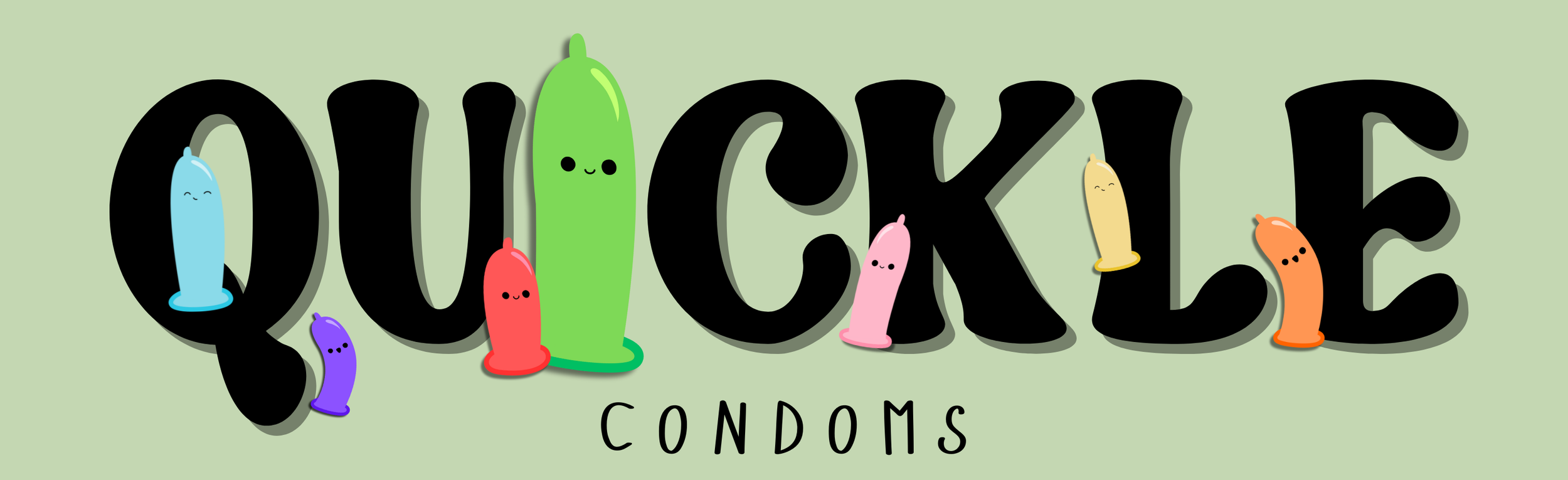
Quickle
Conceptual Product Design Case Study
(Fictional Portfolio Project)
Role
Product Designer & Concept Strategist
Team
Solo Project (Designer & Strategist: Cruz)
Timeline
March 2025 – April 2025
Skills/Tools
Figma, Illustrator, Photoshop, InDesign, Adobe XD, FigJam, Google Surveys
OVERVIEW
Cheeky by Design
Quickle flips the script on outdated sexual wellness branding. Most condom brands feel sterile, clinical, and forgettable — Quickle is bold, funny, and confident. As Lead Product Designer, I built Quickle’s ecosystem across packaging, digital flow, and design systems to destigmatize safe sex and make the experience fun, memorable, and share-worthy.
CHALLENGE
Cheeky, Not Clinical
The sexual wellness market is saturated with clinical, outdated branding that makes buying condoms feel like a chore. Packaging feels awkward. Store experiences are uncomfortable. And many brands miss the opportunity to bring humor and relatability into conversations about safe sex.
Quickle set out to challenge this — by creating a fun, approachable alternative that sparks confidence instead of embarrassment. The goal was to make every moment of the Quickle experience — from packaging to purchase — feel bold, playful, and accessible to all users.
Key Challenges Identified:
Overly clinical branding in the sexual wellness market
Lack of humor and relatability in packaging and marketing
Poor accessibility and design flair across existing products
GOAL
Wrap It Up, Stay Cheeky
The goal for Quickle was to design a cohesive, playful, and fully considered product ecosystem that spans both physical and digital touchpoints. From snack-inspired packaging to a seamless Figma-prototyped checkout flow, every element needed to feel fun, confident, and easy to engage with.
This case study focuses on building a design system that encourages safe sex practices while also pushing my skills in Figma, accessibility-first design, and packaging usability.
Core Objectives:
Build an end-to-end user journey from physical packaging to digital purchase
Design an inclusive, accessible product experience
Use Figma to create scalable systems across brand, UI, and packaging
RESEARCH & DISCOVERY
Understanding the Gaps
Before jumping into design, I started by understanding user pain points and market gaps in the sexual wellness space. Through lightweight research methods, I focused on packaging usability, humor in branding, and overall accessibility.
Key Findings:
User pain points: Packaging feels awkward, humor is absent, and usability is poor.
Market gap: Most brands lack portability, design flair, and playful messaging.
Accessibility research: Prioritized high-contrast colors, readable typography, and easy-open packaging.
Tools Used:
FigJam: Journey mapping & empathy maps
Google Surveys: Insights on packaging preferences
Competitive analysis matrix: Built in Figma for quick comparisons
USER TESTING
Validating Our Designs
To make sure Quickle’s cheeky tone and user flow resonated, I conducted informal usability testing with 5 testers. Using Figma prototypes and packaging mockups, I captured qualitative feedback to guide final improvements.
Goals:
Test if humor-based messaging resonates with users.
Validate ease of checkout flow and overall user journey.
Identify packaging improvements before final mockups.
Methodology:
Shared Figma prototypes and packaging visuals.
Collected feedback via video calls and direct notes.
Synthesized insights directly in Figma for next design iteration.
Findings:
Loved the cheeky tone — users felt the playful messaging worked well.
Sizing clarity needed — testers wanted clearer packaging size indicators.
Fast checkout flow — users described the purchase flow as "super fast and fun."
SOLUTION
Playful & Purposeful
Quickle is a playful yet responsible response to the outdated norms of the sexual wellness industry. The solution combines cheeky humor with smart, accessible design to create a full brand ecosystem that connects physical packaging, digital experiences, and social content.
Every piece of the project — from vibrant product packaging to a Figma-based design system — was built to make safe sex feel bold, fun, and easy to embrace.
Solution Scope:
Brand Strategy & Messaging: Establish a playful, meme-friendly tone of voice.
Visual Identity: Snack-inspired colors, bold typography, and accessible design.
Product Design: Portable, recyclable packaging with humor-forward details.
UX/UI Direction: Figma-prototyped user flow, mobile-first, fast checkout.
Design System: Reusable Figma components for scalability.
Accessibility: Inclusive, high-contrast design across physical and digital.
Social Campaign: Shareable, cheeky content and UGC templates for engagement.
BRAND STRATEGY & MESSAGING
Cheeky Messaging & Lifestyle Positioning
Quickle balances humor with responsibility, turning awkward moments into confident conversations. From day one, the goal was to craft a tone of voice that felt playful, meme-friendly, and unapologetically bold — while staying rooted in responsible, inclusive messaging.
Core Brand Elements:
Name: Quickle (Quick + Pickle = Fast protection with a twist of fun.)
Tagline: "In a Pickle? Don’t worry, we got you covered."
Voice & Tone: Playful, confident, culturally relevant, meme-friendly
Key Messages:
Protection without the pressure.
Safe sex, served with a side of laughter.
Wrap it up, stay cheeky.
VISUAL IDENTITY
Snack-Inspired, Bold Visuals
Quickle’s visual identity is vibrant, energetic, and rooted in snack culture aesthetics. Inspired by the humor and playfulness of snack packaging, I designed a palette of pickle greens and spicy reds, combined with bold, expressive typography to create a standout shelf presence.
Every element — from colors to iconography — was tested for accessibility and cultural relevance. Using Figma, I developed a full visual system including custom illustrations, iconography, and a flexible layout structure to maintain consistency across packaging, social media, and digital experiences.
Visual System Highlights:
Palette: Pickle greens, spicy reds, and bold accent tones.
Typography: Expressive, curvy letterforms for playful energy.
Iconography: Custom icons created in Figma to extend the brand personality.
Accessibility: Verified palette contrast using Figma’s accessibility tools.
PRODUCT DESIGN
Packaging Made Fun & Functional
Quickle’s physical packaging turns a traditionally awkward product into something bold and display-worthy. Inspired by snack packaging aesthetics, I designed wrappers and boxes that are easy to grab, open, and understand at a glance. Matte textures, playful messaging, and stackable POS-friendly box shapes ensure high visibility both in-store and online.
Sustainability was a key consideration. Quickle uses recyclable, biodegradable materials to align with environmentally conscious consumer expectations.
Packaging Design Highlights:
Wrapper Design: Snack-style, easy-open matte wrapper with playful puns.
Box Design: Stackable, clear POS messaging, fun to display.
Material Considerations: Recyclable and biodegradable for eco-friendly impact.
User Flow: Easy store grab → humorous unwrapping experience → safe usage.
UX/UI DIRECTION
Seamless, Cheeky Digital Experience
Quickle’s digital experience mirrors the playfulness of its physical packaging. I designed a mobile-first, fast-paced flow that guides users from product discovery to checkout in just a few taps — all prototyped and refined in Figma.
The user journey is kept intentionally light and humorous, with CTA buttons like "Wrap It Up", "Stay Cheeky", and "Shop Now" to keep the tone consistent. An optional quiz ("Find Your Pickle Size") adds a fun layer of interactivity.
UX Highlights:
Mobile-First Approach: Optimized for responsive design across all devices.
Fast Checkout Flow: Homepage ➔ Product Details ➔ Add to Cart ➔ Confirmation Page.
Interactive Quiz: Playful, optional user engagement to recommend products.
CTA Buttons: Humorous calls to action to maintain brand voice.
Prototyped in Figma: Wireframes and high-fidelity flows built and tested end-to-end.
DESIGN SYSTEM
Scalable Components in Figma
Quickle’s design system was built entirely in Figma, focusing on scalability, consistency, and ease of use across physical and digital assets. By leveraging reusable components, color tokens, and auto-layout structures, I ensured every design decision could flex across packaging, UI elements, and social media assets.
The system includes multiple states for components (default, hover, disabled) and uses variants to streamline the build process. This approach reduced production time and maintained visual consistency throughout the project.
Design System Highlights:
Reusable Components: Buttons, forms, CTAs, and social templates.
Color Tokens & Typography: Defined and applied for consistency.
Auto-Layout: For flexibility and scalability in Figma.
Component States: Default, hover, and disabled for interactive elements.
Variants: Streamlined design updates across Quickle’s ecosystem.
ACCESSIBILITY & INCLUSIVE DESIGN
Designing for Everyone
Accessibility was a top priority for Quickle from the start. I used Figma’s accessibility tools to ensure strong color contrast, readable typography, and an intuitive layout for users of all abilities. Quickle’s messaging also avoids gendered language and relies on visual cues that are clear, playful, and universally understandable.
By focusing on inclusive design, I made sure Quickle’s ecosystem — from packaging to digital — is approachable, legible, and fun for all users.
Accessibility Highlights:
Color Contrast: Verified all brand colors for AA and AAA compliance.
Typography: Easy-to-read, high legibility typefaces.
Non-Gendered Language: Inclusive messaging across all touchpoints.
Easy-Open Packaging: User-friendly physical design considerations.
Visual Cues: Clear iconography and layout hierarchy.
SOCIAL CAMPAIGN CONCEPT
Engaging, Shareable Content
Quickle’s social strategy embraces humor and virality to spark conversations around safe sex. With meme-friendly content, UGC templates, and playful challenges, the goal was to make Quickle naturally fit into everyday social feeds.
Content pillars focused on relatability and shareability, using formats like TikTok dances, Instagram carousels, and meme-style posts. The #CaughtInAQuickle hashtag challenge encouraged users to share awkward moments turned fun, creating organic engagement.
Social Strategy Highlights:
Hashtag Challenge: #CaughtInAQuickle for UGC and viral traction.
Meme Content: Light, cheeky, and aligned with pop culture moments.
UGC Templates: Easy-to-use formats for community engagement.
TikTok & Instagram Focus: Designed for shareability and quick consumption.
Figma-Based Planning: Content grids and post layouts built in Figma for clarity.
TESTING & FEEDBACK
Insights to Improve
User testing was essential to validate Quickle’s playful tone and usability. I conducted informal tests with five users, gathering direct feedback on packaging mockups and the Figma-prototyped digital flow. The goal was to understand first impressions, identify usability blockers, and fine-tune both the physical and digital experiences.
Key Feedback Highlights:
Cheeky tone approved: Users loved the humor and felt it made the topic approachable.
Packaging sizing clarity: Testers suggested clearer size indicators for easier selection.
Checkout flow praised: Described as "super fast and fun" by all testers.
Testing insights were documented in Figma, guiding final design tweaks across the ecosystem.
RESULTS
Projected Impact
Quickle is designed to capture attention and drive engagement across both social media and retail spaces. While conceptual, the strategy and design decisions aim for real-world viability, blending humor, accessibility, and cultural relevance for maximum impact.
Projected Metrics:
Social Engagement: Estimated 100K+ views for TikTok hashtag challenge.
Conversion: Projected 18% social-to-purchase conversion.
Retail Interest: Strong potential for boutique wellness retailers and convenience stores.
These projections were informed by social media trend analysis, user testing feedback, and insights from comparable consumer goods campaigns.
REFLECTION & LEARNING
Lessons Learned
Quickle challenged me to think beyond aesthetics and truly consider how design choices impact user behavior and brand perception. Balancing humor with responsibility pushed me to explore playful, accessible solutions that still carry weight in sensitive product categories.
Using Figma as my central design tool allowed me to build scalable systems, iterate quickly, and create a cohesive ecosystem across physical packaging and digital flows. This project reinforced the importance of accessibility, systems thinking, and designing with cultural relevance in mind.
Key Takeaways:
Systems Thinking: Designing reusable components that scale across packaging, UI, and social.
Visual Consistency: Building a flexible visual identity that translates across platforms.
Accessibility as Foundation: Embedding accessibility in every design decision.
Humor in Sensitive Spaces: Embracing humor to destigmatize and encourage engagement.
CREDITS
Team & Tools
Lead Product Designer & Strategist:
Cruz (TMCRUZ)
Copywriting & Concept:
Cruz (TMCRUZ)
Mockup Assets & Visual Elements:
Adobe Stock, Canva, Figma Community Assets
Tools Used:
Figma, FigJam, Illustrator, Photoshop, InDesign, Adobe XD, Google Surveys
CONCLUSION
View the Full Case Study